One of the most daunting pieces of mathematics that a STEM student might face is the Fourier Transform/Series. For some students, this is covered in an Advanced Mathematics course. For others, including me, this is introduced in a Signals and Systems class. It really looks scary as it combines integration (or summation), exponentials, and complex numbers into one formula. Focusing on transform tables and computing the transforms of different functions by hand can sometimes keep students from seeing the big picture. In this article we will break down what the Fourier Transform does to a signal, then we will be using Python to compute and visualize the transforms of different waveforms.
The most perplexing part of the formula for some students is the exponential with the imaginary number. It is actually a shorthand that can be expanded using Euler’s formula. 3B1B has very good explainer video here.
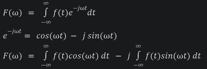
In this expanded form, we can separate the real part, and the imaginary part. Each piece can now be tackled separately! The real part is an integral of the original function multiplied by a cosine. The imaginary part is an integral of the original function multiplied by a sine.
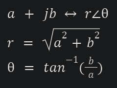
For now, imagine that the sine and cosine terms have a fixed frequency. Let’s say, 50 Hz. Solving the two integrals will give you a complex number in the form of a + jb. It can be converted into polar form by computing the magnitude and angle (commonly called “phase”).
To complete the transformation, you must repeat the process by sweeping all frequencies. This will give you a continuous plot. You will notice that at certain frequencies, your computed magnitude is noticeably bigger, and you will get spikes in your plot. These are the frequency components of your original function. Zach Star has an amazing video about this process on YouTube.
This makes the Fourier transform a sinusoid scanner. It breaks down a complicated function into a sum of sinusoids with varying amplitudes and frequencies. On the next section, we will let the computer do the heavy lifting for us as we feed different kinds of signals to the Fourier Transform to see their frequency components.

Python’s SciPy library includes the Fast Fourier Transform (FFT) which is an algorithmic implementation of the Fourier Transform. We will then be using Matplotlib to visualize them. We will also be framing the examples as audio signals for illustration purposes. The complete code is here on this notebook.
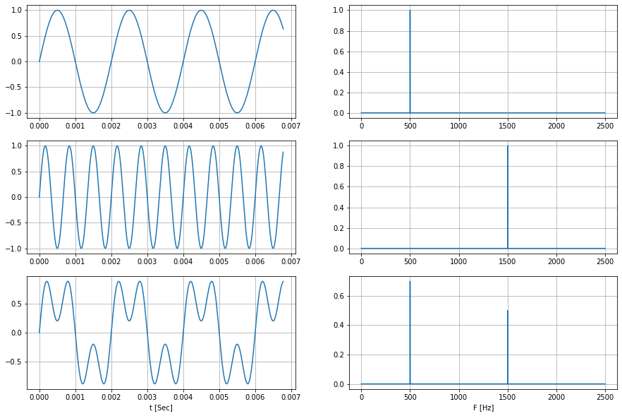
First, we will be using pure sinusoids. One is at 500 Hz, the other at 1.5kHz. You can get the frequencies from the time-domain plot just by measuring the time it took to complete a cycle. Looking at the Fourier Transform, they are just individual spikes on one frequency.
We add them together in the time domain and then take the Fourier transform of the resultant signal. Notice how this plot is the same as adding the Fourier transforms of the individual signal. Although the component frequencies are not that obvious when looking at the time domain of the resultant signal, they are very apparent on the frequency domain.
It must be noted that the Fourier transform covers negative and positive frequencies. It is symmetric with respect to 0 Hz. In this article we only plotted the one-sided transform
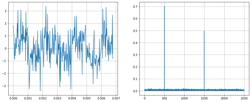
Next, we will add randomness to the signal. This is called additive noise. Now, it is even harder to see the component frequencies in the time domain. Looking at the frequency domain, it can be seen that it is still similar to the plot before. The noise added “magnitude” to all frequencies, but the frequencies of our components still stand out.
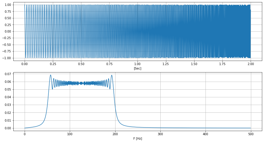
For the next example, we will generate a waveform that changes frequency with time. It is called a “chirp”. This particular chirp starts at 50 Hz and climbs linearly to 200 Hz for 2 seconds. Looking at the Fourier transform, it can be seen that instead of spikes, it is now on a continuous range between the two stated frequencies. You can see in the time-domain the change of frequency, but the “linear” part may not be that obvious. To see how the frequency components evolve over time, we need to look at the spectrogram.
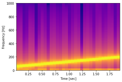
A spectrogram, takes slices (called window) of signal in the time domain and computes it’s FFT. It then slides that window little by little until it has covered the whole signal duration. In this plot, the brighter color corresponds to a stronger intensity. The “linear” climb of the frequency (or pitch) is now visible.
Finally we will be loading a short audio clip of a note being played using a piano. This note is middle C, or C4. On the time domain, we can see how when the key is pressed and how the sound fades away.
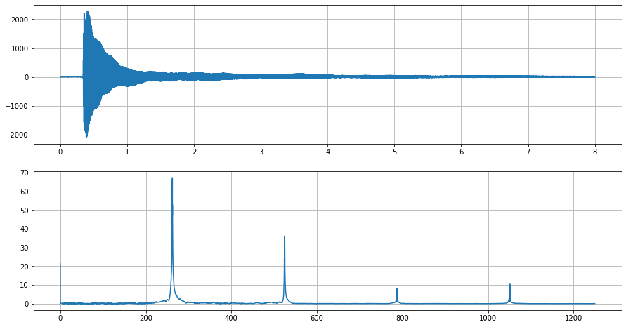
Looking at the Fourier transform, the first major spike will be at about 261 Hz. This is the fundamental frequency of the note and corresponds to C4. The succeeding spikes are at twice the preceding frequency. These are called the harmonics of the sound. There is an odd spike at 0 Hz. This means that the mean of the audio signal is hovering above zero as can be seen in the time domain plot.
To wrap up, beyond the intimidating look of the Fourier transform, it is a process to reveal the component sinusoid frequencies of a signal. Looking at signals and systems in the frequency domain gives us such rich information. For the audio examples that were used in the examples, this can determine the pitch, or notes in a musical recording. Knowing the intuition behind the Fourier transform is a powerful stepping stone to explore more advanced topics in signal processing whether they are audio signals or others.