This case study is my capstone project for the Google Data Analytics Certification offered through Coursera. I was given access to ridership data of a bike sharing company based in Chicago. For the purposes of the project, that company will be called Cyclistic. At the time of writing, Cyclistic has a membership program, but non-members (casual users) can still rent bikes. Casual users pay a flat fee for the first 30 minutes, then a usage fee per minute afterwards each ride. Members on the other hand, pay an upfront subscription fee which covers the first 45 minutes of all rides, then a usage fee per minute afterwards. My goal would be to analyze user behavior between subscribed users (pay monthly) and casual users (pay per ride), and come up with possible suggestions on how to convert casuals, into subscriptions.
Accessing the Data
The course gave us the link to the data as a URL to an AWS S3 bucket. From there, I can download the zip files, unzip to CSV, then upload to Google Drive to make it accessible by the Colab environment. After a little bit of digging into the forums, I found some python libraries, that will enable me to directly access the AWS storage, acess the files, then concatenate them into one Pandas Dataframe. In my code, I chose to use 14 months worth of data. Even though it has millions of rows, it only has a few columns so there were no issues loading all of it into one dataframe.
months = ['202007', '202008', '202009', '202010', '202011', '202012', '202101', '202102', '202103', '202104', '202105', '202106', '202107', '202108']

urls = [f'https://s3-bucket-url/{month}-cycling-data.zip' for month in months]


for i, url in enumerate(urls):
  filename = requests.get(url).content
  zf = ZipFile( BytesIO(filename), 'r' )
  match = [s for s in zf.namelist() if "MACOSX" not in s][0]
  if i == 0:
    print(f'{i}: {url}')
    df = pd.read_csv( zf.open(match), encoding='latin-1', error_bad_lines=False)
  else:
    print(f'{i}: {url}')
    temp = pd.read_csv( zf.open(match), encoding='latin-1', error_bad_lines=False)
    df = pd.concat([df, temp], ignore_index=True)
Data Exploration
The dataframe has the following columns: ride id, rideable type, started at, ended at, start station name, end station name, start station id, end, station id, start longitude, start latitude, end longitude, end latitude, and member type. The activity is semi guided, so I followed some of their advice. First, I converted “started at” and “ended at” columns into a DateTime data type. Next, I created a “trip duration” column and computed its values by subtracting the “ended at” from the “started at” column. Lastly, I was also able to calculate the day of the week from the “started at” column.
df['started_at'] = pd.to_datetime(df['started_at'])
df['ended_at'] = pd.to_datetime(df['ended_at'])
df['trip_duration'] = df['ended_at']-df['started_at']
df['day_of_week'] = df['started_at'].dt.dayofweek
df.dtypes
ride_id object
rideable_type object
started_at datetime64[ns]
ended_at datetime64[ns]
start_station_name object
start_station_id object
end_station_name object
end_station_id object
start_lat float64
start_lng float64
end_lat float64
end_lng float64
member_casual object
trip_duration timedelta64[ns]
day_of_week int64
dtype: objectData Cleaning
About 5% of the data has missing entries on the station names and IDs, however, only about 0.1% have missing coordinates (longitude, and latitude). I have decided that the station names and IDs are not as important as long as I have their coordinates. With that I have decided to drop the rows with missing coordinates. Next, I have looked at the “trip duration” column. For some reason there are durations less than 0. I have decided that these might be errors in the data collection and have dropped them. My remaining dataframe has 6,070,300 rows.
df.isnull().sum()ride_id 0
rideable_type 0
started_at 0
ended_at 0
start_station_name 457789
start_station_id 458414
end_station_name 502382
end_station_id 502843
start_lat 0
start_lng 0
end_lat 6723
end_lng 6723
member_casual 0
trip_duration 0
day_of_week 0
dtype: int64df.isnull().sum()df.dropna(subset = ['end_lat', 'end_lng'],inplace=True)
df.isnull().sum()ride_id 0
rideable_type 0
started_at 0
ended_at 0
start_station_name 457789
start_station_id 458414
end_station_name 495659
end_station_id 496120
start_lat 0
start_lng 0
end_lat 0
end_lng 0
member_casual 0
trip_duration 0
day_of_week 0
dtype: int64Data Analysis
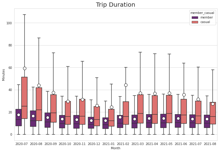
Keeping in line with my goal, most of my analysis would be extracting statistical figures from Cyclistic’s data while separating “members” and “casuals”. Overall, there are 2.7 million entries for casual riders, and 3.3 million entries for subscribed users. At about 45% of the customer share, converting these casual users is very important. The first column that I looked at is trip duration. I has shown that casual users have average trips of 37 minutes, while members clock only at 15 minutes on average. Plotting trip durations as a box-and-whisker plot, we can see that members have an upper range of below 40 minutes while casual users have an upper range of just below 70 minutes. Casual users, tend to ride longer compared to members.
df_cleaned = df
df_cleaned.groupby('member_casual').ride_id.count()
member_casual
casual 2777040
member 3293260df_cleaned['trip_duration_m'] = (df_cleaned['trip_duration']/np.timedelta64(1, 'm')) # convert time deltas to minutes
df_cleaned.groupby('member_casual').trip_duration_m.mean()member_casual
casual 36.689239
member 14.656500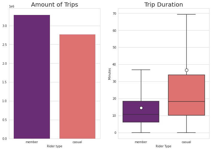
Weekly Analysis
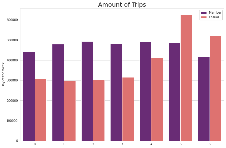
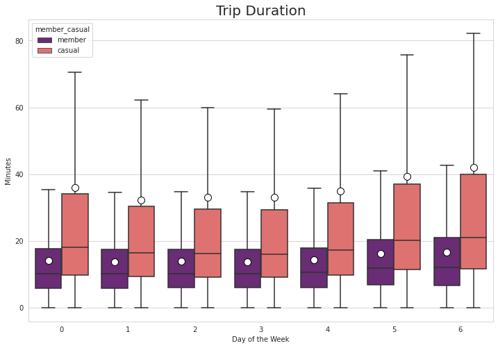
Splitting the data between the days of the week, it has shown that member trips outnumber casual trips during the weekdays, but it is reversed during weekends. Saturdays seem to be the peak day for casual trips. Looking again at trip duration, members have a fairly constant riding duration during the weekdays and it only increases by a bit during the weekends. For casual riders, however, the difference is much more obvious as the mean during weekdays are between 30 to 40 minutes but it exceeds 40 minutes on Sundays. The upper outliers for casual riders also reach above 80 minutes during Sundays.
table = pd.pivot_table(df_cleaned, values='ride_id', index=['day_of_week'],
columns=['member_casual'], aggfunc=lambda x: len(x.unique()))| member_casual | casual | member |
|---|---|---|
| day_of_week | ||
| 0 | 306862 | 443135 |
| 1 | 296247 | 479191 |
| 2 | 301500 | 493630 |
| 3 | 315615 | 481753 |
| 4 | 410522 | 490886 |
| 5 | 624963 | 486302 |
| 6 | 521331 | 418363 |
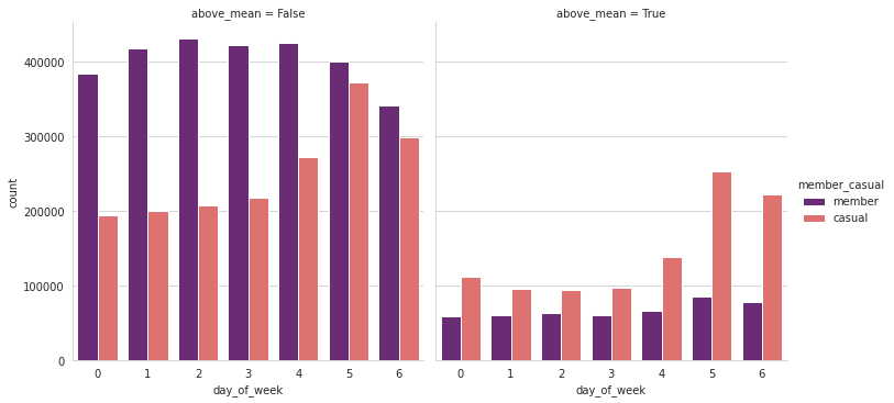
The overall average trip duration is 25 minutes. I then filtered the data to split the trips that are above and below this threshold. In the graphs below it shows that weekend trips that are above the average length is dominated by casual users at almost 3:1.
Seasonal Analysis
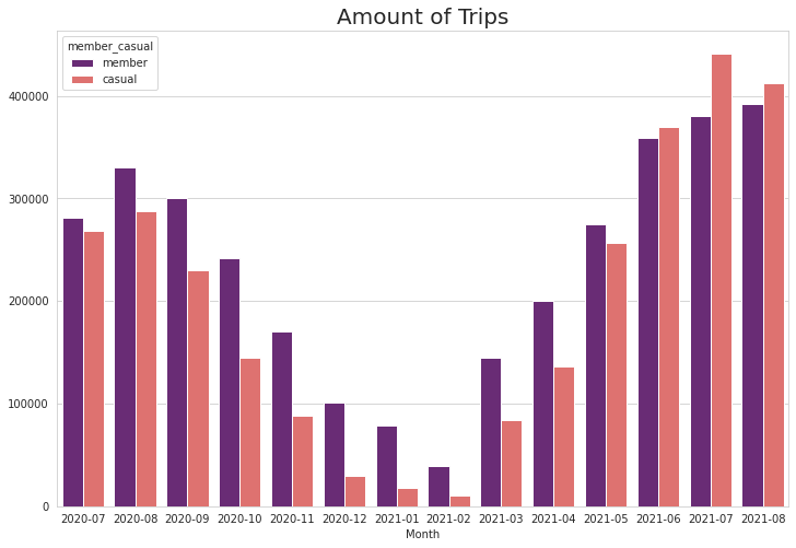
Next, I have taken a look at splitting the data by month-year. This column can easily be extracted from the “started at” column. My data covered July 2020 to August 2021. Looking at the number of trips, it followed the expected curve of dropping during the cold winter months, and recovering during the Spring and Summer. Interestingly, During June 2021, the amount of casual rides have surpassed the member rides and it has persisted until August.
df_cleaned['month'] = df['started_at'].dt.to_period('M')Taking a look at the trip duration from the monthly perspective, The very long trips made by casual riders were mostly from 2020. The mean trip duration for casual during July 2020 was 60 minutes, and it was down to about 30 minutes for July 2021. The trip duration has still shown an expected decline during winter months but there is an interesting spike of 44 minutes for casual trips during February.
Combining Seasonal and Weekly Analysis
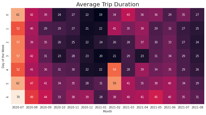
Combining the days of the week and the month into a heatmap (thanks to Pandas pivot tables and Seaborn’s heatmaps) we can see that the Saturdays of July 2021 is when the service got the most casual rides. Aside from the peak of trip duration during July 2021, the increase in duration for February 2021 was during Fridays and Saturdays.
table = pd.pivot_table(df_cleaned[df_cleaned['member_casual'] == 'casual'], values='ride_id', index=['day_of_week'],
                    columns=['month'], aggfunc=lambda x: len(x.unique()))

fig, ax = plt.subplots(figsize = (12,8))
p = sns.heatmap(table, cmap="rocket", ax = ax, annot = np.round(table.values/1000, decimals = 0), square = True, cbar = False)
p.set_ylabel('Day of the Week')
p.set_xlabel('Month')
p.set_title('Amount of Casual Rider Trips', fontsize = 20)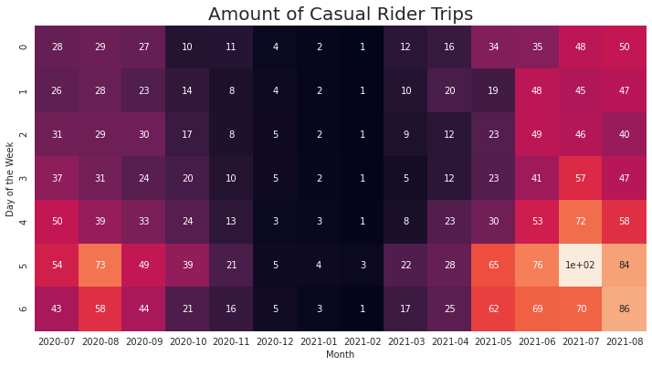
Geographical Analysis
My next step was to map out the rides over Chicago using GeoPandas. This is my first time using the library so I had to dig through some forums and documentations. My initial dataset already has longitude and latitude for the start and ends of the trips. I downloaded a Shape file of Chicago that delineates its communities. I then mapped the coordinates of my dataset to the same coordinate reference system of the Chicago shape file. Next, I tried to compute the displacement between the start point and end points. All of my results are less than a kilometer. I am not that sure of this result. Maybe, all users just return their bikes to a station near where they borrowed it, or there is some mistake with my calculations. For now, I just decided to not include the displacement in analysis.
chicago_areas = gpd.read_file('/DATA _ANALYTICS/chicago_areas.shp')
gdf_start = gpd.GeoDataFrame(
    df, geometry=df['start_point'], crs = chicago_areas.crs )

gdf_start.crs
<Geographic 2D CRS: EPSG:4326>
Name: WGS 84
Axis Info [ellipsoidal]:
- Lat[north]: Geodetic latitude (degree)
- Lon[east]: Geodetic longitude (degree)
Area of Use:
- name: World.
- bounds: (-180.0, -90.0, 180.0, 90.0)
Datum: World Geodetic System 1984 ensemble
- Ellipsoid: WGS 84
- Prime Meridian: GreenwichThe next part was for me the most exciting as it is really new to me. I have coordinates for the starting point of trips, and with GeoPandas I can plot them over a map of Chicago as points with a very low opacity. That map would show where the trips are most dense. For the analysis, this would’ve probably sufficed but I want to learn more about GeoPandas, so I tried to turn it into a “Choropleth” map. Choropleth is a type of thematic map in which a set of pre-defined areas is colored or patterned in proportion to a statistical variable that represents an aggregate summary of a geographic characteristic within each area, such as population density or per-capita income. Now, the challenge would be how to aggregate the longitude and latitude data into the communities into which they belong.
There is a dissolve method in GeoPandas but when I tried it on my data, the process was still ongoing after 30 minutes. I was able to achieve my goal using spatial join method instead. With this, I was able to replace the coordinate columns of my dataset, with the polygon data of the community that they belong to.
gdf_to_join = gdf_start[['ride_id', 'geometry', 'trip_duration_m', 'day_of_week', 'month' , 'member_casual']]
gdf_joined = gpd.sjoin(chicago_areas[['community', 'geometry']], gdf_to_join[gdf_to_join['member_casual'] == 'casual'])
gdf_joined[['ride_id', 'community', 'geometry']]| ride_id | community | geometry | |
|---|---|---|---|
| 0 | 60710371A15481FD | DOUGLAS | POLYGON ((-87.60914 41.84469, -87.60915 41.844… |
| 0 | E3A472F33EE0D769 | DOUGLAS | POLYGON ((-87.60914 41.84469, -87.60915 41.844… |
| 0 | A1335D66E569836A | DOUGLAS | POLYGON ((-87.60914 41.84469, -87.60915 41.844… |
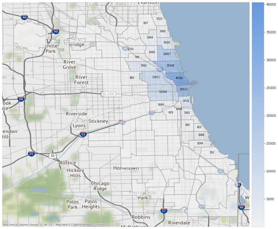
Similar to normal Data Frames, I can do sort and filter operations on Geo Data Frames. I used Contextily to add a map with road networks underneath my plot. For the map below, I plotted the areas with highest monthly average trips. I only labeled those that are above 500 trips. A quick web search told me that the most popular area is Chicago’s downtown, and it radiates outward.
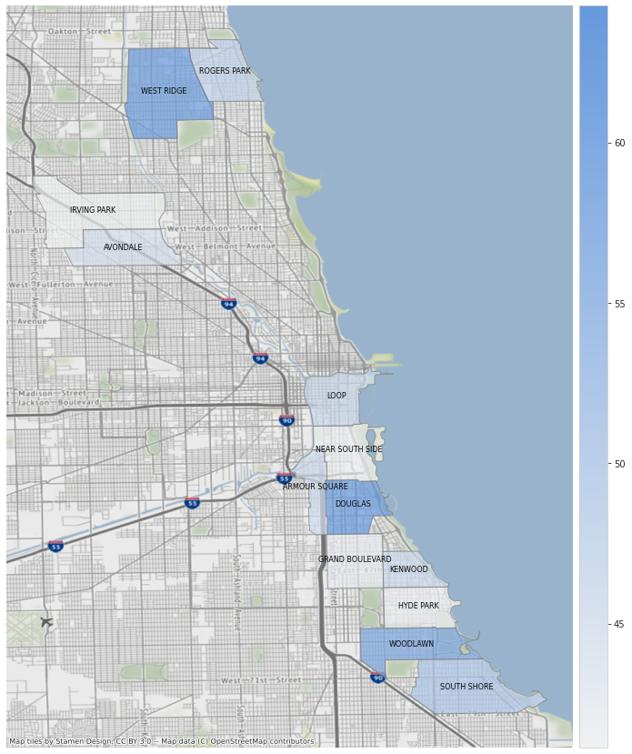
For this this map, I only focused on trips made from March 2021 onwards. I plotted the areas with average weekend trip durations above 40 minutes. The Loop area is still included as well as some areas near the lake shore which also has high ridership. Note that since I didn’t plot the polygons for other areas included in the Chicago shape file, my background map zoomed in and the street network is visible now.
Summary of Analysis
The analysis show that:
- There are more riders during warmer months.
- Casual riders outnumber annual members during weekends.
- Casual riders have longer average trip durations
- Most rides are concentrated at/near the central business district and radiate out from there
Actions that can be implemented
- Launch a limited time promotion for new annual members during the start of spring with a lower upfront payment. The data show that warmer months correlate with more trips. Catching these influx of riders with a lower upfront payment at least for the first year can encourage them to be an annual member.
- Increase the included time during Spring-Summer weekends for new members. The data has shown an uptick in ride duration and casual riders during weekends. At the time of writing, the included minutes for members is at 45 minutes which is just slightly above the casual users’ weekend average .
- Reserve a number of bicycles to members only for the most popular locations during summer weekends. This time period has the highest demand, having some reserved bikes could be a good motivator to subscribe.
Final Thoughts
In this project, I was able to practice data analytics skills using Python such as wrangling, cleaning, and visualization. My most used libraries were Pandas and Seaborn. Similar to when I am using spreadsheets for smaller datasets, I find pivot tables to be extremely useful when comparing values across categories. I was also able to learn mapping of geospatial data using GeoPandas. Using Spatial Join to make Choropleths from point data is really useful. Overall, I would say that this is a nice capstone for the Google Data Analytics Certification.